Streamlining the Vacation rental booking process for swift and intuitive user experiences.
VRBO


UX Redesign
VRBO- “Vacation Rental By Owner” is a popular platform that connects travelers with vacation rentals by different property owners.
As a part of one of my classes at San Jose State University, ‘Human Computer Interaction’, I worked on a redesign of a product with an evidence-based design solution. My group chose to work on VRBO a travel booking app which is vacation rentals by owner similar to Airbnb but less popular among the users.
Responsibilities
Usability testing, Heuristic Evaluation, Persona mapping, Wireframing, High fidelity prototyping, User testing
Team
Abhishek Dhane
Nicholas Yuan
Pranav Meda
Poorva Jain
Duration
Sep 2023 - Dec 2023
Tools
Figma
Zoom
Google Sheets
01 Problem
VRBO, despite being a major player in the vacation rental market, struggles with a smaller user base (48 million) compared to Airbnb (150 million). This creates challenges in user retention, engagement, and growth.
🎯 Why is it important?
The disparity in user base limits VRBO’s ability to attract renters and property owners, leading to a retention rate of 40%, far below industry benchmarks. Addressing these issues can help VRBO increase its market share and improve the booking experience.
💸 What impact does it create?
Low user engagement reduces property listings and limits booking opportunities, which directly impacts revenue. Improving user experience can increase conversion rates by up to 25%, driving both user satisfaction and platform growth.
👥 Who are we solving for?
Renters looking for a seamless, intuitive platform.
Property owners who need wider exposure and ease of management.
02 Benchmarking
Comparing and understanding the competitors
Parameter
VRBO
AirBnB
Booking.com
Accommodation Options
Focuses on private properties like homes, apartments, and condos, with options to specify accessibility needs.
Offers diverse accommodations, including private and shared spaces, with filters for special needs.
Provides a commercialized selection, including hotels and vacation rentals, with added vehicle and flight arrangements.
Searching for a rental
Features curated destination lists and travel guides on the home page.
Allows filtering by property type and map view early in the search process, enhancing discoverability.
Includes a search feature for locations and accommodations, with additional offers and car rental options.
Owner-Guest Communication
Emphasizes direct communication between guests and owners, with an in-app messaging center.
Encourages communication through a prominent in-app message center.
Lacks emphasis on direct communication; interactions occur externally.
Review and Rating System
Users rate rentals from 1-5 stars, with host replies allowed.
Offers detailed star ratings and aggregate traits, with a search bar for specific reviews.
Provides a comprehensive system with verified reviews and detailed parameters like cleanliness.
Cancellation Policies
Standardized policies with partial or full refunds based on timing.
Varies by rental, with flexible cancellation details based on host preferences.
Highly flexible, varying by accommodation type and policy.


03 Usability Testing
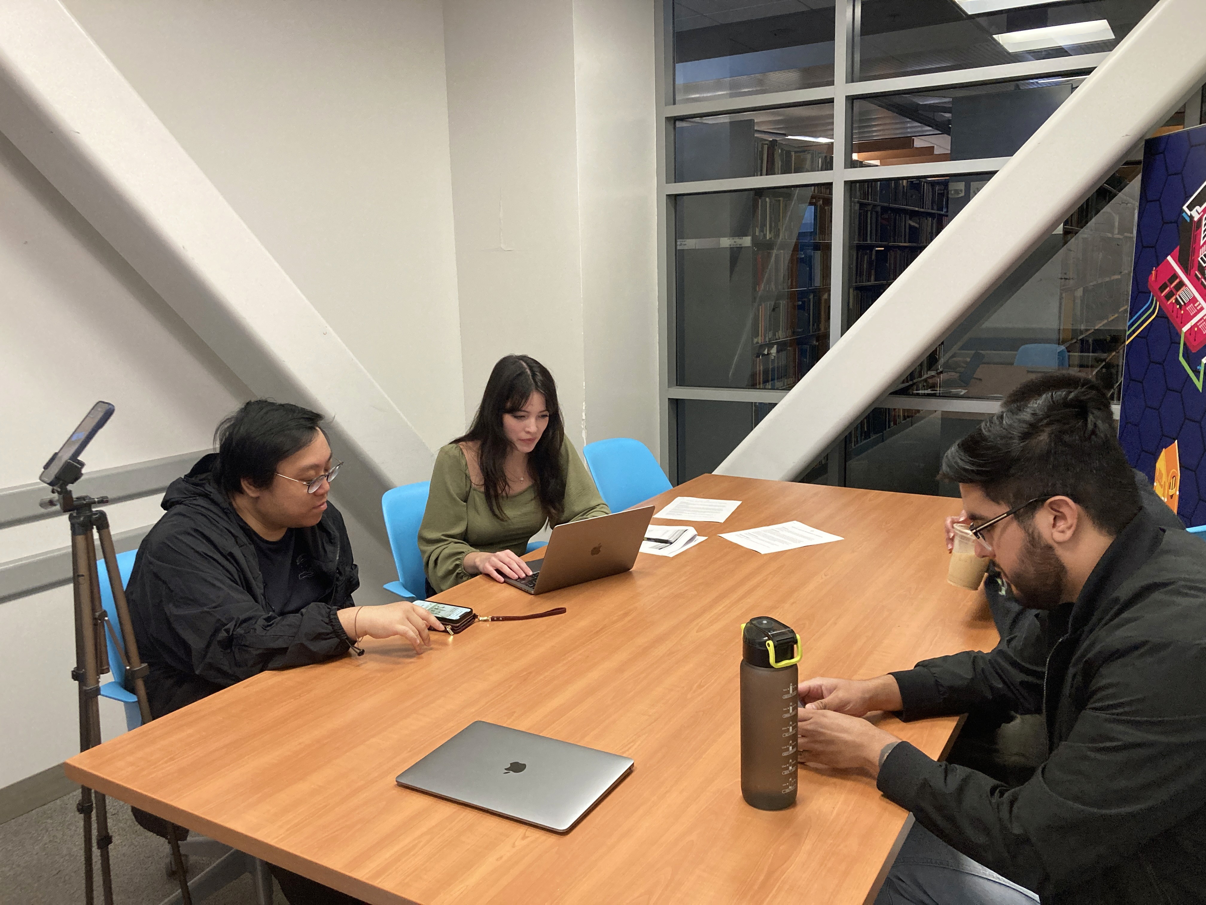
We conducted usability tests on the current app with over 8 users to understand the pain points.


Some comments from users
04 Research Insights
What do Users feel while navigating through the App ?
😖 Frustration
Users feel frustrated with the app’s navigation, particularly the cumbersome process of going back and forth, leading to a disjointed experience.
😕 Confusion
Many users express confusion over the map functionality and the lack of clarity in the interface, such as unclickable elements and unclear naming conventions.
😞 Disappointment
Users are disappointed by the app's failure to provide sufficient information about nearby tourist attractions, which diminishes its utility for trip planning.
05 Pain Points
What is wrong with the existing app?


Logo too big. Taking 15% of screen space.
No clear information on what this feature is
Searching process is not intuitive and has multiple steps
Too much white space
Recent searches dosen’t look like a affordance
Home Page


Map feature is not a affordance and is very confusing and not useful
Again this feature is not a affordance and not giving any useful information
Filters feature is lacated in different place across different pages
Design is not consistent across property listing pages from different searches
Property Listing Page
Final Verdicts
Complex and Non-Intuitive Search
The search process is overly complicated, requiring multiple steps, which frustrates users and makes the app difficult to navigate.
Lack of Clear Affordances
Important features like the map and recent searches do not look interactive, confusing users about their functionality and purpose.
Poor Use of Screen Space
The oversized logo (15% of screen space) and excessive white space reduce the focus on core content, wasting valuable screen real estate.
Inconsistent Design
The design lacks consistency across different pages, particularly with filters and property listings, making the user experience unpredictable and fragmented.
06 Design Strategy
Using the research insights and some secondary research, we finalized 4 use cases to focus on.
Simplify Navigation
Streamline the navigation flow by implementing a more intuitive layout. This can include a clearly defined back button, breadcrumb trails, and a simplified menu that allows users to easily access different sections without excessive scrolling.
Provide Contextual Information
Integrate a contextual help feature that offers users insights into local attractions and experiences based on their search criteria. This can include curated lists, user-generated content, or personalized recommendations to enhance the trip planning process.
User Feedback Mechanism
Implement a clear user feedback mechanism that provides confirmation messages and visual cues for key actions. This can help build trust and reduce confusion regarding whether actions have been successfully completed.
Enhance Map Interactivity
Improve the map feature by making it fully interactive and clickable. Introduce tooltips or pop-ups that provide additional information about points of interest and ensure that users can easily switch between map and list views without losing their search criteria.
07 User Persona
Use a seamless and intuitive app that saves time during travel.
Efficiently filter and compare properties while on the move.
Quickly access detailed information about nearby attractions for video shoots.
Find unique, visually appealing accommodations for content creation.
Confusing map feature, making it difficult to plan around locations.
Inconsistent filter placement across different pages, disrupting his workflow.
Oversized logo and excessive white space, limiting the view of listings.
Lack of clear interaction cues, causing delays when using app features.
Goals
Frustrations
Alex is a full-time travel vlogger who is constantly on the move, creating content for his YouTube channel and social media. He travels frequently and relies on apps to quickly find unique, budget-friendly accommodations in different locations. For him, time is critical as he juggles content creation, travel planning, and interacting with his audience. He needs an app that is efficient and visually appealing, with accurate information to help him find the best places to stay.

Alex Rodrigo
Quickly find and book family-friendly vacation rentals.
Use an intuitive interface that simplifies the search and booking process.
Get reliable information on nearby tourist spots for planning.
Inconsistent design across different pages, creating an unpredictable experience.
Unclear feature affordances (e.g., maps and recent searches), causing confusion.
Large logo and too much white space, limiting content visibility.
Multi-step, complex search process that wastes time.
Goals
Frustrations
Emily is a busy professional who loves to plan family vacations in her limited free time. She usually books vacations online, looking for family-friendly accommodations, good locations, and easy-to-navigate apps that don’t take too much time to use. She expects booking a trip to be hassle-free so she can focus on enjoying the trip with her family rather than being bogged down by the app experience.
Emily Thompson

05 Design Iterations


07 Design System
Used the same design system used by VRBO for their current application
Typeface
The five boxing wizards jump quickly.
20px
1.25rem
The five boxing wizards jump quickly.
16px
1.0rem
The five boxing wizards jump quickly.
14px
0.875rem
The five boxing wizards jump quickly.
12px
0.75rem
Freight Sans
Sans Light
Sans Medium
Sans Bold
Brand Colors
Colors
#1C4695
#A8C8E5
#F0F7FF
08 Proposed Solutions
Redesigned Homepage to consolidate all search criteria into a single section, simplifying the user experience and making it faster for users to start their search.
Dedicated FAQ page for OneKeyCash has been introduced, which is accessible directly from the homepage
The travel guides have been updated with a filtering option that allows users to search based on activity type (e.g., hiking, sightseeing)
The search listing page has been redesigned with consistent filter, sort, and map placement across all searches, and larger property boxes for improved visual clarity.